Improving Course Offering Usability
Role: Design lead, facilitating, directing
Team: 3 designers, 3 Product managers, 10+ engineers
Timeline: 2019 - 2022
Challenge
The Course offering product is how employees engage with learning content and objectives. Employees are motivated to remain compliant and meet employer expectations, or upskill/reskill in areas of interest. For years, the product has not changed in any major way to stay connected to employee needs. We set out to modernize the product.
Senior leadership wanted a redesign but didn’t provide any further details to guide the direction. I scheduled stakeholder interviews to understand needs, reviewed user research, and conducted customer advisory sessions to understand pain points & opportunities. I then shared concepts to illustrate the vision, which was followed up with engineering’s feasibility analysis. This allowed leadership team to realize the level of investment required to align with customer and user expectations.
Aligning with senior leadership
Customers have complained for years about the dated user interface and a fractured interaction flow that caused their employees to be delinquent on compliance training or miss training opportunities. Customers expected an intuitive product that helps their employees and organization remain enegaged and grow thier career.
What customers want
Users expected the course experience to mimic online learning experiences familiar with the likes of LinkedIn learning, Coursera, Degreed, etc. Users want more than just course descriptions. They want to see how a course is tied to learning paths, know what the agenda before attending class. For users segments that must remain compliant at all times, they expect registration confirmations, course progression and completions. Users also want access to micro-learning that will help them accomplish specific tasks in the workplace. They want relevant course content based on their day to day tasks or career goals and aspirations.
What users want
Overview of the old experience
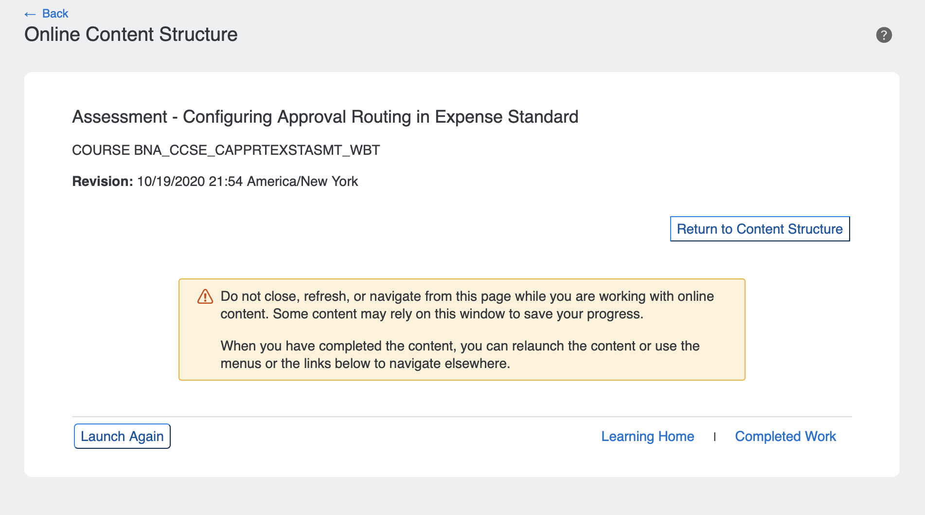
Old course offering detail page
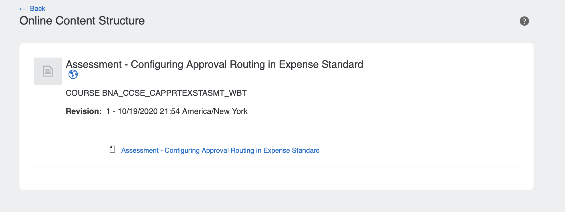
Access to content list page after starting the course. This is meant help the user find their way back to the content list incase they get lost.
Old content list page. This is where the user can access content for the course.
Approach
In favor of satisfying customer demands, senior leadership decided to modernizing the course offering product within the existing LMS architecture. They hoped that by prioritizing the course product after years of complaints, customers would support the direction.
This tactic was perceived as a way we could prove to customers that we were listening to their demands. But this architectural decision had a major impact on the quality of the experience we could create and for the design team to reconcile.
Fast and cheap won’t make it good
Feature design and development were divided among 4 teams between the UI Experience platform and Module owner. I collaborated and led the design across 4 teams.
Each feature phase of the project started with the module owner prioritizing use cases for API development. Once aligned, requirements were written and shared with the UI Experience platform team. From there designers would review requirements to begin wireframing. Once features were designed and approved, the UI Experience platform engineers began implementation. Concurrently, I would review designs to ensure consistency across platforms. I would also ensure designers were not sacrificing usability for technical constraints.
Too many cooks in the kitchen
We kickoff the process with a comprehensive review of the old experience. I invested time auditing 3 of the widely used course types (Online, Instructor-led, Blended).
I facilitated a story mapping exercise with cross-functional members to help designers ramp-up on product knowledge - this drastically reduced the amount of time spent reading through requirement documents.
Process
During the audit to understand the current experience for course types, I was able to find common form elements and interactions in the registration flows for Instructor-led and Blended. I identified course elements like description, instructor, contact information, location, duration, substitute and related courses common across all three types. While the audit was time consuming on my part, the team saved a lot of time by designing solutions that could be used in all three. The effort also helped our engineers with API and UI implementation.
The content player is one of the main features in the Course offering product that employees interact with to navigate through content in all three classifications (Online, Instructor-Led and Blended).
I audited the content player feature and I identified potential friction points for employees related to the following course configuration settings: content types, content availability, content status, and assessment completion.
These settings were not represented in the UI and were a source of confusion because users were not updated on their progress while completing a course. So, imagine if you were invested in taking a course and could not track your milestone progression nor completion of it.
Our architectural decisions in the early phase of the project prevented an ideal solution for tracking and progression status for the employee. But I needed to ensure the design strategy was accomplished by offering an experience employees expected.
To establish course tracking, I created a new matrix of requirements based on the content configuration settings. This allowed us to determine how to technically achieve tracking for the user.
For the UI, I designed a player shell that would fit any content type (eg. PDFs, videos, word docs.) and used status icons to communicate availability and/or progression for the user. I worked with engineers to mimic real time content status and was able to improve a real pain point for employees.
Content Player
Solution
Leverage existing product capabilities while also delivering a customer experience that closely met user expectations. We aimed to increase usability by utilizing familiar patterns and flows that are common to learning experiences.
Design goal
A month prior to internal feature releases, we created prototypes to validate our design solutions. We set out to test product perception and the usability of major flows like registration, content progression and completion, etc.
What employees liked:
“I love being congratulated - feels like I had a successful day”
“Includes relevant information. Gives me confidence about taking a course.” “Looks modern and clean, it’s easy to use”
Following each test, we asked test participants to respond to our questionnaires to learn more about how we’ve improved. Based on the results, we improved our System usability Scale (SUS) Score from 68.8 (C-level) to 72.5 (B-level).
By no means was this an ideal experience. But due to technical constraints, this was the best solution the team could design. As a result, adoption is on the rise, which indicates users and customers appreciate the direction that we’re headed in.
Validation and Results


